Direct mail can be cheap and impersonal, or it can be cheap and personal. Generic campaigns put you in front of your customers, but do you capture their attention? With variable data printing, small businesses and marketers in niches can vary their marketing campaigns to target the specific needs of a diverse audience without having to create multiple pieces that may only be useful for one campaign.

What is variable data printing?

Variable data printing is a printing method that allows for some parameters to be changed, such as text and images, within an entire output as many times as desired. This is most often used in direct mail to change names and addresses. The software uses a spreadsheet created by the user or the mail house to determine what input goes where on the material. While it certainly makes creating large scale direct mail campaigns much easier and cost-effective to print, it can be used to further customize direct mail to a customer’s preferences and buying history, personalizing direct mail so that it appears that the it was made just for that customer.

How can variable printing help your direct mail marketing campaigns?

1. One print run. One direct mail campaign can be changed to target specific demographic groups with just a few tweaks. One campaign, one print run, one template. This makes small print runs affordable, and all print runs with a faster turnaround time.

2. Make it personal. If there’s one thing anyone is going to read on your direct mail (besides the word “free”) is their own name. This much variable printing can do, but to further capture a customer’s interest, a mailing, flyer, or catalog can be printed with targeted advertisement so that this customer is receiving what appears to be custom-made letter.

A campaign can target demographic groups or individuals by changing any content to appeal to that group. This would not only increase your return on investment, but allow you to experiment and create test campaigns smaller and more targeted than A/B tests.

3. Eye-catching images, fonts and colors. Customizing fonts, images, and colors allows you to completely transform your direct mail so that one campaign actually functions like many smaller, exclusive, niche campaigns. You could even use the same template over again and simply change the parameters to suit your needs.

4. Make it local. Do you have a storefront, or two? Do you sell your products in brick and mortar stores, at the farmer’s market, a festival? Let your customers know where to find your wares with maps and custom-printed lists of stores, hours, and directions to the places where they can buy your products.

5. Urgent message? A holiday-only sale? Moving locations? Opening a new store in a certain area? Announcing a new product line that a certain section of your customers would be interested in? Variable data printing can help you launch that direct mail with a few changes to an existing template so you can put the news out there immediately.

Creating custom information doesn’t have to be time-consuming and is not only available to those with huge print orders. With variable data printing, you can create multiple, personal, and tailored direct marketing pieces to appeal to each of your customers as individuals.

Contrary to popular belief, Guttenberg did not invent printing; he invented the printing press. Printing itself began in China with wood-carved reliefs of each character that could be pressed onto a medium like silk. The Chinese also invented moveable type, too. However, early forms of printing were still expensive and time-consuming. Guttenberg’s printing press solved both of those problems. Even though it could take a full day to set one type tray, his metal letter molds and oil-based ink made presses more durable and faster, thus making books cheaper and more available to the public. Guttenberg’s printing press changed the world, and from 1430 on, we haven’t looked back.

Hand-scribing books meant limited books…and limited literacy

Before the printing press, books in Europe were hand-scribed, and thus with books difficult to come by and very expensive, few other than the elite could read. Granted, these books often contained beautiful calligraphy and artwork, and illuminated manuscripts were real works of art. The mass-produced books weren’t so beautiful, but they made information more accessible to a middle class that was becoming increasingly literate. The cheaper books were, the more literate the masses became.


Mass-production meant more freedom to disseminate information.

With books being more widely available to the public and cheap to buy and produce, more books, and thus, more ideas, could be shared. Before the printing press, the most commonly scribed book was the bible and the church had among her ranks most of the scribes; scientific and philosophical ideas couldn’t be so widely shared with the world. The Gutenberg press took the monopoly of publishing from the church and put the power into the hands of whoever could pay to run the printing press. Not only could more books be printed, but also pamphlets and other documents. Martin Luther’s 95 Theses, for example, used broadsheets akin to today’s newspapers.


Newspapers inform us all

Even if it took one person a long time to set a type page, once it was set, it could keep printing pages repeatedly. Having a group of people setting type pages for a group of presses meant that multiple pages could be created and printed that day, giving rise to printed news. Newspapers arose in the 17th century and became more widespread in Europe and the United States in the 18th century. They’re essentially still the same as they’ve been for centuries. Whereas news could be largely shared by mouth through conversation, public decree, or other announcements, printed news could share the same facts and the same information with everyone who could read, reaching a larger audience more quickly. With the invention of the telegraph and then the telephone, regional, national, and world news could be disseminated daily, sometimes more ofte.


Books could be mass-produced for information and instruction.

Cookbooks, history books, and a variety of fiction and non-books became possible with the printing press. Ideas that were novel or even controversial, such as scientific theories, philosophies, or political ideas could reach a wide audience through use of the printing press. Anyone who could read a book could expand their horizons and teach themselves any subject they had the interest or stomach to learn. Without books, a country boy born in a one-room log cabin in rural Kentucky could learn math, language, history, and law despite having no one around him to teach him. This country boy in particular was Abraham Lincoln, sixteenth president of the United States.

Knowledge became egalitarian.

For those who could read, could access books and newspapers, and had the curiosity and time to read could know just as much about a subject as someone who had a formal education if they read and retained enough. Books were still cheaper than tutors or private education, and in some places, books were much more readily available than a comprehensive formal education.

Those who could write and entice someone to publish the works for them or could afford to have their books published did so. This meant that visionaries didn’t have to rely on the approval of the establishment to get their works out there. For example, Walt Whitman, the father of modern poetry, was heavily involved in the printing and publishing of his book, Leaves of Grass. Thomas Paine’s self-printed Common Sense pamphlet advocated for the 13 American colonies to seek independence from Great Britain and was read widely in meeting places…and taverns.

The birth of the novel.

While the art of storytelling is something that we have always had with us, and classics and epics like the Iliad were hand-scribed on scrolls, the modern novel couldn’t have really existed without the printing press. In order to create a work of fiction to entertain a wide variety of people, the writer would need access to cheap, uniform printing methods. The easier it was to publish books, the more possibilities there were for writers to create and share works of fiction with others.

One press = uniformity in language.

Hand-scribed books were often full of errors or variations in spelling and grammar. However, with the printing press, spelling became uniform. In fact, the need to save space on a type page meant fewer extraneous letters and punctuation. Sharing information with a variety of people meant that they all had to understand what was being written and shared. Thus, over time, spelling and grammar became standardized. Lettering, too, became more simple and easy to read. Now, every written language also has a consensus of how words should be spelled and sentences written.

Your business card is a visual representation of you and your brand, so it’s important to design a business card that provides the reflection you crave. Many people are handed business cards every day, so it pays to make sure yours stands out. With the right design, you can leave a lasting impression on someone who could become your next customer. Follow these steps to design the business card perfect for your business.

Decide on a Message

Think about what message you are wanting to send with your business card. Do you want to appear unique? Creative? Professional? What are you hoping your brand communicates about you? Reflect on your personal brand identity so that you can share this messaging with your designer.

Consider a Different Shape

In a world full of the same rectangular cards, one easy way to stand out is to use a different shape. Technology is available today through new printing techniques that allow you to cut your card in any shape you want while still allowing you to print in bulk. You might prefer rounded corners, a card in the shape of your product, a shape that mimics your logo, or cards that have a portion of the card cut out for artistic purposes.

Add Your Logo and Other Graphics

Next, add your logo and other desired graphics on the card. You can work the text around these visual elements. Ensure that your logo has its own place to shine as this is what most people will associate with your brand. Some designers prefer to use one side of the card for your logo and the other for your information and other graphics. Additional graphics can fill the space on a business card. These graphics allow you to provide a more creative look to your card. You can showcase pictures of your staff, products, small and big logos or other images or graphics that reflect your business.

Decide on Text

This is an important consideration because it is what you explicitly communicate to your customer. Consider adding the following information to your card, as needed:

  • Your business name
  • Your name
  • Phone number
  • Business address
  • Job title
  • Email address
  • Fax number
  • Website URL
  • Social media contact information
  • Business slogan
  • QR code

Select Your Typography

Now that you have narrowed down your graphics and text, you will need to think about how you want your card to look. Consider the size of each block of text on your card. Everything needs to be 8 pts. minimum for people to read. However, you might want certain text to stand out more by making it larger, such as your name or the name of your business. You may also want to retain some white space for a more professional look. Choose a font that mirrors your personality. Use a color scheme that reflect your branding. Stick to colors that provide a nice contrast on the card but that are also easy to read.

Add Special Touches

There are many more ways that you can make your card stand out. One option is to use embossing, which creates a three-dimensional image and emphasizes certain areas of your card. Or, you can choose the reverse with letterpressing in which the printer presses the paper down while it inks it, making it look engraved. Foil stamping makes your text shiny. Spot UV coating provides a sheen to certain parts of a card. Another way to make your card stand out is to make it wider and thicker. You can also consider alternative materials like metal or rubber or use scented inks. Finally, transparent cards create a modern, sleek design.

After you take the steps to design the perfect card for your business, reach out to a designer at Pel Hughes to make your vision a reality.

One of the most important factors to consider when printing is DPI, or dots per inch. Basically, DPI is a measure of special printing dot density which consists of the number of individual dots that can be placed in a line within the span of 1 inch. When choosing a resolution, it’s all about determining the point at which you can no longer see the dots in an image. The more dots, the higher the quality of print.

It’s also helpful to point out that many resources, including the Android developer guide, use the term pixels per inch, or PPI, interchangeably with DPI. While these terms are similar in nature, PPI is technically the term used for monitors. (Monitors have pixels, not dots.) When discussing printing, DPI is the correct term and it can make a big difference in the sharpness of your printed work.

So with that brief overview, the question remains: What DPI should I use for my particular print job? As you may have guessed, the correct answer is, it depends. Below are some tips to consider when deciding on a DPI, as well as some suggestions for specific printing designs.

It’s (Mostly) About Viewing Distance

As mentioned above, the main focus (no pun intended) when choosing the correct DPI centers on the point at which you can no longer see the individual dots on a page. While the method of printing and the material may have a slight impact on the resolution, the viewing distance can be the difference between 300dpi and 1dpi. If you think about it, that makes sense.

Consider looking at a billboard on the side of the road. It’s rarely viewed closely, so a resolution of 20-50dpi is probably sufficient. However, when viewing a printed image on a menu for example, you’ll want a higher DPI so the print doesn’t look grainy or blurred. The key when considering DPI is to consider how far your viewer will be.

Choosing the Correct Material and Methods

In addition to contemplating the audiences viewing distance of an image, the printing method and material also have an impact when determining the correct DPI. The method and material will affect how sharp an image will be; the higher DPI used, the sharper the image. For example, the Print Handbook is printed using a stochastic screen which produces a finer detail than a halftone screen. The different material will produce a print that looks different when using 300dpi and 400dpi.

Conversely, there are other instances when the limiting factor is the paper/material or printing method and as a result, there is no need for 300dpi. One such example of this would be printing on coated vs. uncoated paper. Coated paper tends to hold detail much better than uncoated paper, and because of this limiting factor, you can likely get away with using 200-250dpi on uncoated paper whereas the same DPI would not be suitable for print on coated paper.

Choosing the correct DPI can indeed be the difference between a good and a great print. It is important to understand what DPI is and which DPI should be used for your specific print job. It’s also important to consider the distance at which the print will be viewed, as well as the print material and methods used. However, given all this, it’s typically better to err on the side of a larger DPI. You can rarely make the mistake of having too high a resolution. But it is very easy to use a low DPI and have your final result come out pixelated. In the end, go for too much detail as opposed to not enough. 

Contact Pel Hughes if you have more questions!


With today’s fast paced environments, you need something that can grab attention and convey information quickly. Vinyl banners are a must. Vinyl banners are great for promoting products, conferences, sporting events, corporate gatherings, or even personal events such as birthday or graduation parties. They are most effective if you incorporate large, bright images as they easily get attention.  People usually special promotion, event, team or school.


Designing a vinyl banner

For the most part, designing files for banner printing requires the same procedures as any other products. However, are a few designer tips for this product that you can take into account. They are as follows:

  • When designing files for larger banners, there tends to be more flexibility in terms of resolution for vector-based elements. One would be able to get away with submitting files that have a 150 dpi. Keep in mind that this does not apply to image based elements. Images such as logos and photographs should always be at 300 dpi.

72 dpi vs 300 dpi

  • Banners that have the grommet option selected should always account for this in the bleed. For instance, the normal recommended bleed is .125 inches. On banners with grommets, bleeds are recommended to go up to a square inch on all corners.

vinyl banners pel print

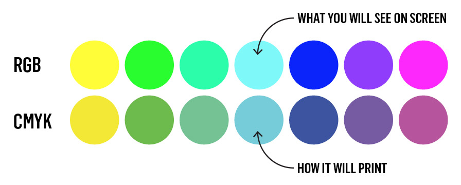
  • Remember that all files are always converted to CMYK before printing. Any neon’s and Pantones cannot be printed on banners. Be sure that when designing files for the banners, you are doing so in CMYK. This will ensure that you get a clearer idea of the color densities on your banner piece.  Keep in mind that different screens produce different colors; final prints will not be able to match 100% what is seen on the screen.

rgb vs cmyk


Design tips:

  • The type of vinyl matters depending on the occasion. Glossy banners work best when you are hanging them inside, away from natural light. Matte banners are perfect for outdoor advertising. If you hang glossy banners outside it can sometimes be difficult to read the words due to the glare during the daytime.

  • If you are looking to reuse your banner, don’t include information that could easily change such as a price point or date. It’s better to advertise saying “Everything 50% Off Regular Price–This Friday, Saturday and Sunday” instead of “All Meals Just $5.99 on Saturday, May 12”. This way you’ll end up with banners that can be reused time and time again. The best part–banners can be rolled up, folded, etc., making them extremely convenient to store for later use.

  • Determine the space you need to hang your banners carefully; take measurements of the space(s) when possible. Consider how you could be mounting the banners. They can be set up with grommets that allow for roping the banners, or pockets to slip poles through. If you are using ropes to tighten the banner corners, then consider the room you would need to stretch the banner.

A signature is a group of pages that are printed, most likely on both sides of a single sheet of paper that once folded, trimmed, bound and cut, become a specific number of pages. The number of pages on a signature depends on your page size and the size of the press sheet they fit on.

print signature

Another term associated with a print signature is a less common term that is known as imposition.This is the placement and direction of pages that are in a signature. Some pages may appear upside down or backwards, but once the sheet is folded and cut, the pages will be in their proper position and sequence. It is the printer’s job to setup a signature’s imposition.

Printers will often speak of two kinds of spreads: reader spreads and printer spreads. When you open a brochure, page two is opposite from page three. This is a reader’s spread; it’s what the reader sees. If you take the brochure apart, you’ll see that page two is actually connected, through the binding, to another page near the back of the brochure. This is a printer spread; it’s what a printer prints.


How to create brilliant designs on a budget?

As a print designer you should take full advantage of working with print signatures to achieve maximum effect for your design concept and learn how to maximize the printing budget.

Instead of using the same paper stock for the whole brochure, you can use different papers and different combination of inks for each individual print signatures. The possibilities are endless for creating amazing brochures.

Each signature is a print run and for each print run, you have to choose a paper stock and the number of inks to be used. The number of inks you print per signature on a specific paper will not only affect your design concept, but the print budget directly.

When designing with print signatures, you also have to take into account from the start, your binding type. Your binding type always depends on the total amount of pages your brochure has, your design concept and the printing budget. By selecting different binding types, it will change the order in which print signatures are assembled in the final brochure, therefore giving you the ability to manage the order in which different papers are presented.

For example, when you use ‘saddle stitching’, first page will go with last page, second page with before last page and so on. If you use a ‘perfect bound’, signatures are stacked one after the other. In the case of a ‘spiral bound’, signatures are also stacked one after the other, but you can insert a single sheet pretty much anywhere and the brochure will lay flat when open. Understanding how different binding types work, is essential to get the most out of designing with print signatures. The ‘pull out’ is another, different type of signature. It could be considered a loose sheet, even though it’s folded, depending on where it’s inserted in the binding. But most pull outs are commonly inserted between two signatures, during the binding process.

The important thing to remember is that when it is bound together, when a job is laid out correctly, the right pages will almost magically turn up next to each other. The more the number of pages in a job, the tougher it is to lay it out correctly. A proof is always sent out before any printing is actually done and one of the things to check for is that all the pages have ended up in the correct order.


When creating your print design, there are some simple yet common mistakes we want to help you avoid. These errors can make an otherwise smooth printing job a complete pain. Here at Pel Hughes we want to make sure your printing experience is altogether flawless – just like your final product. Read on to find out which mistakes you can easily avoid.

1. Using a Low Resolution Image

Though you might not believe it, we are not miracle workers. We have moments, but on the whole, we can’t do too much to fix a poor quality image and ready it for high resolution printing. While a file may look fine while on your screen, it can very easily turn out blurry if the correct resolution is not set. The quality of your printout will be determined by the dots per inch (dpi) and the resolution. An image with 300dpi will be of much better quality compared to the one with 72dpi, which is why 300dpi is recommended.

Another way to work around the issues low resolution images present is to save all of your images as vectors. What is a vector, you ask? Unlike images created from pixels, vector images are made up of a series of corners and curves that allow them to be enlarged and maintain high resolution. We’re big fans of vectors.

2. Failing to add Bleed

You will notice that at times the document layout will extend to the edges of your design. In this instance, it is important to use “bleed,” which will extend your colors past the edges of your document. After printing the design, you can trim off this extension, ensuring that there is no white edge on the finished product.

3. Setting the Incorrect Size

Before sending the design for printing, you should confirm that it matches your desired size. You should also ensure that the design is positioned correctly and has the right proportions. If you intend to have a have a 25 x 25mm sticker, you should set the layout at 31 x 31mm so as to include the bleed area. After setting your document correctly, you should send it to the printer without making further changes. There are many pre-set templates which can be downloaded online including PDF versions with step-to-step guides on how to set your design’s proportions correctly.


4. Using Incompatible Software

Help us help you by saving your work in the version of software we’re working in. This might require you to pick up the old phone and give us a ring, but we’ll all appreciate being on the same page when it comes time to print! Once you know what version to work in, you’ll need to backdate the file by saving it as an EPS and then picking the correct version of Illustrator.


5. Making Simple Spelling Errors

Last but MOST DEFINITELY not least is the fatal error of including spelling and grammar errors in your piece ready for printing. While we’ll do our best to catch any obvious mistakes, please make sure to be double, triple, and quadruple checking your materials. The very last thing you want to discover on the 600th copy of your gorgeous new mailer is a silly and avoidable spelling error.


Avoid these headaches, and always feel free to give the team at Pel Hughes a call with any questions! We can’t wait to hear from you.

Did you know there is a professional way of folding paper? Yes. There is a correct way to make those crisp lines, and if you don’t believe us, go grab a cereal box and do a little experiment.

Take said cereal box and disassemble. Now take a square section of the box and fold it in half to create a clean, sharp line.

How’s it looking over there? We’re going to guess it’s looking neither clean nor sharp.

That’s why “scoring” exists in the great wide world of paper products. In short, scoring is the creation of a crease in a piece of paper that will allow it to fold easier and result in a better looking line.

This is achieved by creating a ridge in the paper with an indentation device, and that ridge is where the fold line will occur. Typically this line is made by using a piece of metal to compress the fibers of the paper in one small area in order to create a dip in the paper where it can easily fold.

You can score paper as it goes through the printing press (inline scoring) or you can score the paper after it is finished printing (offline scoring). We recommend offline paper scoring as it tends to be more precise and offer the printer greater control over the process.


So why score paper?

It’s all about looks. Scored paper is less likely to “buckle” or “crack” while being folded, and it decreases the chance that the folding process will hurt the ink that is delicately placed on the surface of the paper.


When should you score?

Scoring is most effective when used upon heavyweight papers like cardstock and cardboard. It makes sense that these varieties would be more resistant to our manipulations as they are thicker and more stubborn. Generally, the thicker the paper, the wider the score.


Tips for scoring paper:

  • Only use new paper. Old paper tends to be dryer and less receptive to a successful score
  • Always score with the grain of the paper, never against
  • Score one practice piece before scoring an entire batch
  • Once scored, fold the paper so the hinge is on the inside of the fold


If you have any additional questions about paper Scoring or any other printing or finishing operation, give Pel Hughes a call. We’re always happy to answer your printing related questions.

First impressions last. You’ve got seconds to ensure that first and lasting impression is positive. A well designed, unique business card is a fantastic way to make a strong impression.

Business cards are they key to presenting yourself in a good light and impressing important people. If you think of designing your first business cards soon, or changing the design of those you already have, here are some tips to keep in mind.


Decide on a concept

Do this by thinking about the customer you’re trying to impress, and deciding what would tell the story of your business for that customer. Your images (if you use any), colors and textures should all be consistent with your existing marketing materials, and all of those should be right in line with the brand values that distinguish your business from everyone else.


Decide on specifications

  • Size: The most common business card size is 84 mm by 55 mm, or 3.5 inches by 2 inches. You can go bigger, but if you do your cards are less likely to be kept. In recent years, mini and circular business cards are becoming more popular.


  • Orientation:
  • Landscape format is more traditional and still the most common orientation. It is easy to read, works well in card holders and can be handled by any printer. However, it is very common, and not as unique as other options.
  • Portrait is a clean and elegant look that’s become more common in recent years (but still stands out).


Use high quality paper

Nothing says “I don’t care about you, and I don’t deserve your business” like using cheap paper on your business card. At the very minimum use 16pt gloss or 100lb matte — anything lighter will feel flimsy and cheap. Also, never — ever — print them out at home. There are many professional shops (like ours) who offer business cards at a reasonable price.

Put the right information on the card

  • Name
  • Name of organization or business
  • Job title
  • Your contact information—any that people might want. We suggest e-mail and phone number at a minimum, social media profiles and website unless you really have no presence at all, and a work address if that seems relevant.
  • Your logo
  • Check your file settings


The file for your cards should be saved correctly—not just for today, but for when you might need reprints later on. Make sure your designer has the file just right:

File size, type and resolution

Any images, like your logo, must be at least 300dpi to have a high enough resolution to look crisp and clean.

For best quality and a crisp look, your design should be saved as a vector-based PDF, not JPEG or PNG. You should also make sure you get an editable file (usually an Illustrator, Photoshop file or editable PDF) so that you can make changes later.


Bleed

The bleed refers to highlighting an area 3 mm or about 1/10 of an inch thick surrounding the document with the same color as the background to prevent border strips from showing. The background color should go all the way to the edge. All text should stay within the safe area.

Fonts and color settings

All text should be embedded and you should have the correct font licenses. Use CMYK color mode for anything that will be printed, including business cards. Do not use RGB.

Are you ready to show off your brand? Contact Pel Hughes today to get started!