Creativity can make all the difference in a direct mail campaign. In fact, creative direct mail can make choosing your business over your competition a reality. If you’re feeling stuck with where to start, consider the following direct mail examples, some from well-known titans of industry, to help spark some inspiration.
Netflix Sends an Evidence File
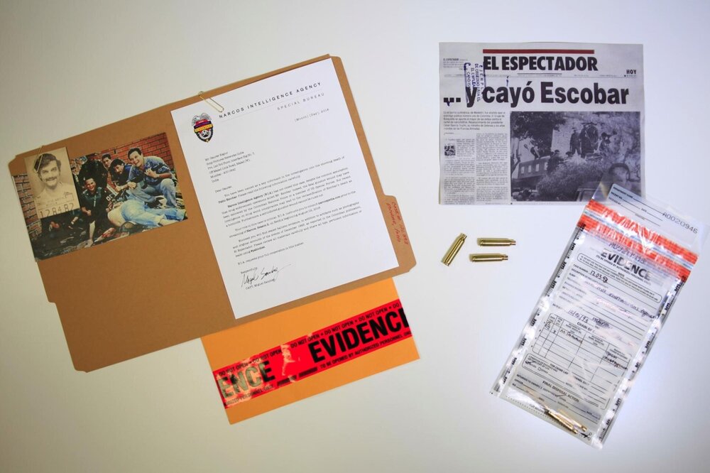
To promote its award-winning series about drug lord, Pablo Escobar, Netflix sent direct mail containing a mock evidence file to entice viewership. This campaign was lauded by consumers and advertising experts alike for its creativity.
Use Die Cutting for a Creative Direct Mail Campaign

This campaign from Bite, a burger joint in Florida creatively used die cutting to their advantage. Die cutting is a printing technique where a metal die is used to make unique borders and other elements. In this case, die cutting made it possible to resemble a “bite” being taken out of its mailer.
Implement Variable Data Printing to Convey Convenience

With variable data printing, this campaign printed custom maps on each envelope to provide a visual aid for its recipients. This tactic is great for brick-and-mortar businesses like boutiques, dental practices, and other small businesses operating from a static location. Sometimes, showcasing your convenient location is all you need to win over a consumer.
Target New Movers Through Direct Mail

New movers make excellent customers. The first business of its kind to reach a new mover yields loyal customers. Using a direct mail campaign to target new residents is an effective way to grow your business. Be sure to include enticing incentives like discounts and bundles. Targeting new movers is great for retail stores, restaurants, and healthcare-related businesses.
Include Coupons

Perhaps one of the most well-known campaigns to utilize coupons is Bed, Bath, & Beyond. You’ve probably received one of these coupons at some point in your life. Including coupons in your direct mail can bring customers to your doorstep. Marketing research shows that it’s hard to pass up a coupon; in fact, including coupons makes a consumer 50% more likely to shop with your business.
Use Unique Shapes to Entice Patrons

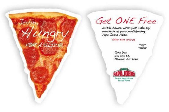
Most mail comes in rectangular form. When you step outside this common shape, you can grab your customer’s attention. This creative direct mail campaign, like the example from “Bite” above, utilizes die cutting to form the shape of a pizza. The high-resolution image makes this “slice of pizza” from Papa Johns even more tantalizing.
Our team of printing pros at Pel Hughes can make your creative direct mail visions a reality. We utilize sophisticated technology and advanced printing techniques like die cutting and variable data printing to boost the effectiveness of your direct mail campaigns. Our family-owned enterprise also offers campaign automation, database management, and graphic design. If you’re looking to take your print advertising to the next level, give our experts a call at (504) 486-8646.


