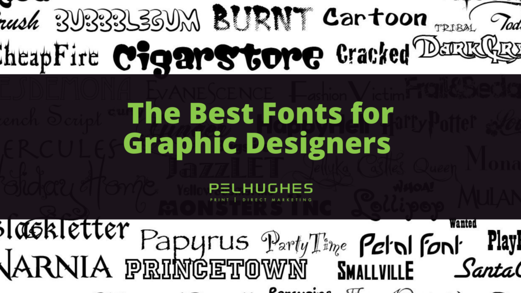
The Best Fonts for Graphic Designers
Graphic design is no longer constrained to the artful presentation of documents or websites. Improvements in mobile tech and the world wide web have forged new paths for communication. Everything from the design of online stores to the aesthetics of logos, banners, flyers, slogans and brochures shapes customer perception. Font is particularly important at conveying a message in a truly artful manner. The best graphic designers select fonts with care as each typeface has its own unique style.
The Font Selection Process
Choosing a font for a particularly project seems fairly easy yet the process is quite difficult once all of the options are on the table. Choose the wrong font and the text will put customers in a bad mood, fail to convey the merits of the product/service or possibly sabotage an otherwise-acceptable design. So don’t underestimate the importance of selecting the ideal font. Above all, the font you select should be legible. This means the font should be clear and readable with ease. Each font character should be easily recognizable, regardless of whether it is presented in caps, lower case letters, italics or bold.
The target audience matters a great deal when it comes to selecting a font. Learn everything you can about your target demographic and where the advertisements will be placed. Once the typical customer’s perspective is established, it will be that much easier to select the appropriate font. It might even make sense to use several different fonts in unison. Keep an open mind and always opt for the font with the most visual appeal.
Font Examples: Serif/Sans-Serif
Serif fonts are those with lines at the end of the characters. This style of font is ideal for serious projects. The font type is also available without the forementioned lines at the ends of characters. The line-less version is referred to as sans-serif. If you are looking for a modern design, sans-serif is worth consideration.
Gotham
Gotham is a relatively new font, debuting less than a couple decades ago. This ultra-modern font is professional and sleek. If your presentation requires a bold look, give serious consideration to this distinct font.
Rockwell
Rockwell hit the scene way back in the early 1930s. This font is grouped with slab serif as it has a mono-weight aesthetic created with geometric shapes. Rockwell’s luxurious aesthetic appeals to upper and middle-class audiences while empowering the designer to retain a high level of quality. This font is typically used to inject some charm into a presentation.
Caslon
Named for designer William Caslon, this font is available in numerous forms. Caslon is generally suitable for body content and corporate typefaces. Furthermore, Caslon is used in books of varying sorts, magazines and journals.
Helvetica
Graphic designers around the globe favor Helvetica for good reason: it is a a professional font that has a truly idiosyncratic aesthetic. Though some insist the spacing between Helvetica letters is insufficient, most onlookers admire this highly unique font.
Bodoni
Bodoni is best noted for its distinct typeface that has proven optimal for logos of varying sorts. Bodoni has also been used in headlines, highly decorative texts and fashion advertising. The unique use of thin and thick strokes makes Bodoni quite visually intriguing.
Garamond
Garamond arrived nearly 30 years ago. This subtle yet striking aesthetic is optimal for website, magazine and even textbook design. Anything geared toward education will look fantastic when presented in Garamond font.
Frutiger
Made by Swiss designer Adrian Frutiger, this typeface has been dubbed humanist as each character is designed with a focus on legibility. Take one look at Frutiger characters and you will immediately notice just how clear they are. You can read Frutiger characters from close or far. Whether you are looking for a font to be featured on a sign or any sort of display work, Frutiger is one of the better choices.
Trajan
Trajan has more of an authoritative feel. Commonly used on movie posters, this font looks both professional and forceful.
Bickham Script Pro
Created by Adobe back in the late 1980s, this font was initially meant to be used in-house yet quickly spread to designers across the world. This distinct typeface is optimal for generating visuals and items to be printed for formal events. Bickham Script Pro is artful while simultaneously simplistic, presenting a lovely visual balance with true mass appeal.
Futura
If you have limited space to work with, consider the Futura font to maximize your impact. Futura is the ideal match for those designing a new logo or slogan. The font’s geometric base makes each character appear similar to circles, triangles, squares and other basic yet visually appealing shapes.