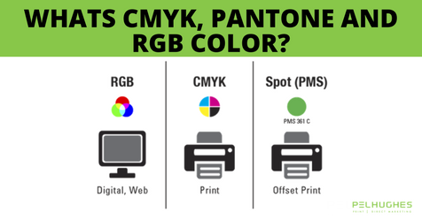
What’s CMYK, Pantone and RGB color?
In the world of print and design, color plays a huge role in helping your marketing materials stand out from the crowd. On the one hand, a gorgeous design and lovely colors can draw attention and strengthen your brand’s image; while on the other hand, weak or clashing hues can result in a less than eye-catching design.
The Importance of Color in Branding and Advertising
Human beings are visual creatures. Colors make a lasting impression. Think about some of the biggest brands. We all know the unique red hue behind Coca-Cola products or the vibrant colors that make up NBC’s peacock logo. Color is the foundation of your brand’s image.
To better understand the power of color, consider the following facts and statistics:
- Proper execution of color boosts brand recognition by 80%
- Roughly 85% of consumers’ purchases are influenced by color
- Color has a powerful effect on consumer behavior and brand loyalty; it raises the visual appeal of a brand or product by 93%
Types of Color Models
So, what are the things you need to know about color and printing to create your best work? Let’s start off with talking about the differences between the two main color models, RGB and CMYK. These two color models have very specific roles in the print and design world, and we’ll explain them here.
RGB
RGB (red, green, blue) is what we call an “additive color spectrum.” This means that in the RGB model, red, green, and blue produce every other color by “adding” together into something new.
In this system, color is emitted from natural or produced light. When they are added together, they produce white light. This is the color spectrum that is used to create images on all types of screens (computer, television, phone, etc.)
When the RGB colors are combined, they actually create the next model we will cover: CMYK.
- Green and blue create cyan (C)
- Red and blue create magenta (M)
- Red and green create yellow (Y)
CMYK
CMYK (cyan, magenta, yellow, black) is what we call a “subtractive color spectrum.” This means that in the CMYK model, cyan, magenta, yellow, and black produce darker colors as they’re added together.
In this color system, color is produced by absorbing light. When they are added together, they produce black. This is the color spectrum used to create rich colors on printed materials.
Pantone
Pantone isn’t really a color system, it’s a “color matching system” that uses founder Lawrence Herbert’s numbering system for identifying, matching, and communicating colors. The system uses a numbering system to label each specific color.
By doing this, the Pantone system helps to create consistency in the printing industry. No matter where your printer is located, Pantone 199 Red will be the exact same (and so will every other Pantone color), so you can breathe easy knowing that your materials will turn out right
So why is it important to know the difference between color systems?
You should know which color system you need to use for each specific project. For example, if you know that your work will be displayed digitally on a screen, you will be using the RGB system. However, if you are designing materials that will later be printed and displayed, make sure you are working with the CMYK color system or at least understand that what you are seeing on the screen in RGB will differ from the final printed product.
Do you have questions about creating brochures, business cards, and more in vivid color? Give Pel Hughes a call at (504) 486-8646. Our experts can help you develop stunning logos and printed materials.


