Business Card Design: Fails To Avoid
Business cards typically contain the same information such as a person’s full name, their work number, an e-mail address, a logo, and sometimes a link to a website. While these important bits of information are uniform and important, the design of business card as well as the quality of stock its printed on can leave a recipient wowed, unaffected, or underwhelmed. A well-designed, quality business card is an important mode of making connections with other businesses as well as potential clients or consumers. Sadly, poorly-executed business card design can leave a sour taste in the mouths of folks you’re looking to do business with. Following are some business card faux paus that every professional should avoid.
#1 Illegible Business Cards
It might be tempting to shrink the size of your font so that you can pack more information on your business card. It may also be tempting to use a cursive-like font to set yourself apart from other enterprises. Small and hard-to-read fonts will affect the legibility of your card. As a rule of thumb, do not use a font smaller than 8pt. Do your best to stick to fonts in the Serif or Sans-Serif families for maximum legibility.
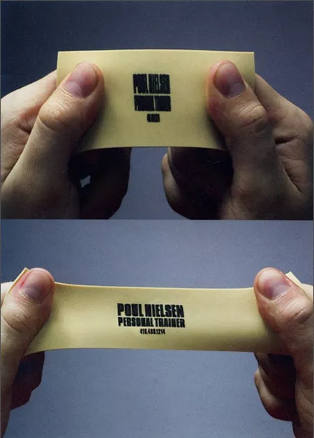
Below is an example of extreme illegibility. This card was used for a personal trainer and while the “stretching” aspect of its design is clever, it is difficult to read and practically unusable.

Image Source: Creative Bloq
#2 Busy Business Cards
Sometimes, the DIY approach to business card design can fail spectacularly. In the example below, you see a rainbow-themed color scheme with a dizzying array of fonts. Quite a lot of the card’s copy is unreadable. This card could be easily improved with a minimalist and simplistic overhaul. Sticking to the same fonts, sizing them appropriately, and removing the excessive use of color would make a world of difference.

Image Source: Creative Bloq
#3 Business Cards Made of Materials Other than Paper
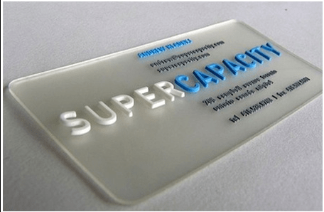
Just because a business card could technically be made from anything, it doesn’t mean it’s a good idea. In the past, there have been trends where business cards were made of plastic or metal. Fortunately, these trends fizzled out quite quickly. In the example below, you can see a plastic business card with heavily raised copy.

Image Source: Choose What
The simple fact is that business cards should be made from paper only. After you give out a business card, it will end up in someone’s wallet or a card holder. If your business card cannot fit into these places, it will likely wind up lost or in the waste bin. If your design is so eccentric that your card can’t even be stacked with other cards, you may even build a little bit of resentment with potential clients or customers—which is something no professional wants.
While these bad business card design examples make the case for simplicity and minimalism, it doesn’t mean that your business card has to be boring. Professional printers can add flare to your business cards that won’t compromise your professionalism or your personality. For instance, the pros at Pel Hughes often use advanced printing techniques such as Spot UV and foiling on business cards that have striking effects. Our team of graphic designers can help you make a card that stands out in all the right ways.
Pel Hughes is a family-owned printing company serving businesses and organizations in a variety of industries. Give our friendly experts a call at (504) 486-8646 to start your next printing project.


